Code
# Use custom function in SMDO repo
source('dev/get_dimension_ggraph.R')
get_dimension_ggraph(
  csv_path = 'data/trees/wiltshire_tree.csv',
  dimension_in = 'Production',
  y_limits = c(-1.5, 2.1),
  palette = "ggthemes::stata_s2color"
)
This page describes the various iterations of indicator sets for the production dimension. First, we observe the indicators included in the dimension at three points in time. The second section then shows the results of the survey following the indicator refinement meeting.
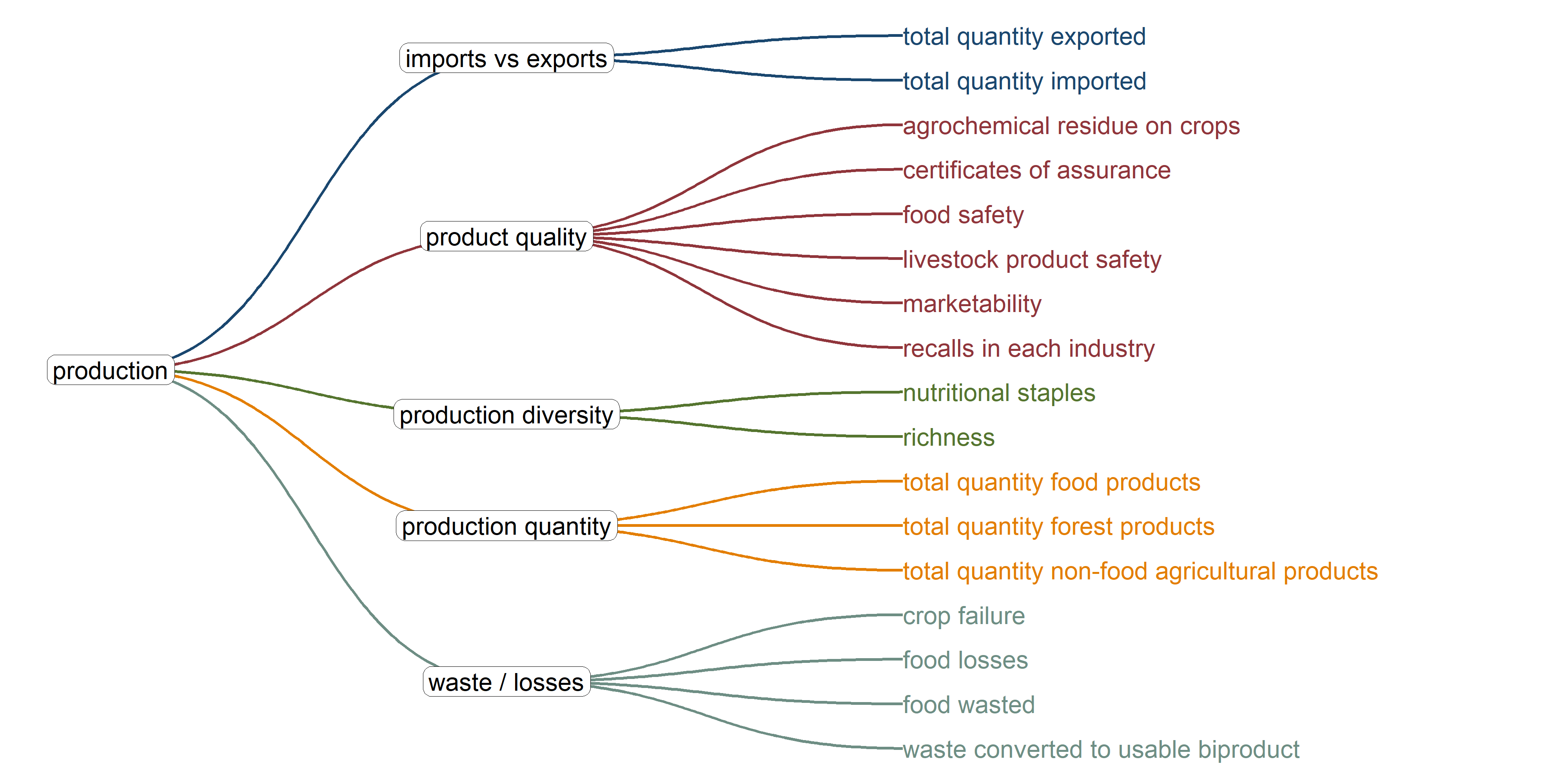
This graph shows the original framework for the dimension as described in the Wiltshire et al. paper.
# Use custom function in SMDO repo
source('dev/get_dimension_ggraph.R')
get_dimension_ggraph(
csv_path = 'data/trees/wiltshire_tree.csv',
dimension_in = 'Production',
y_limits = c(-1.5, 2.1),
palette = "ggthemes::stata_s2color"
)
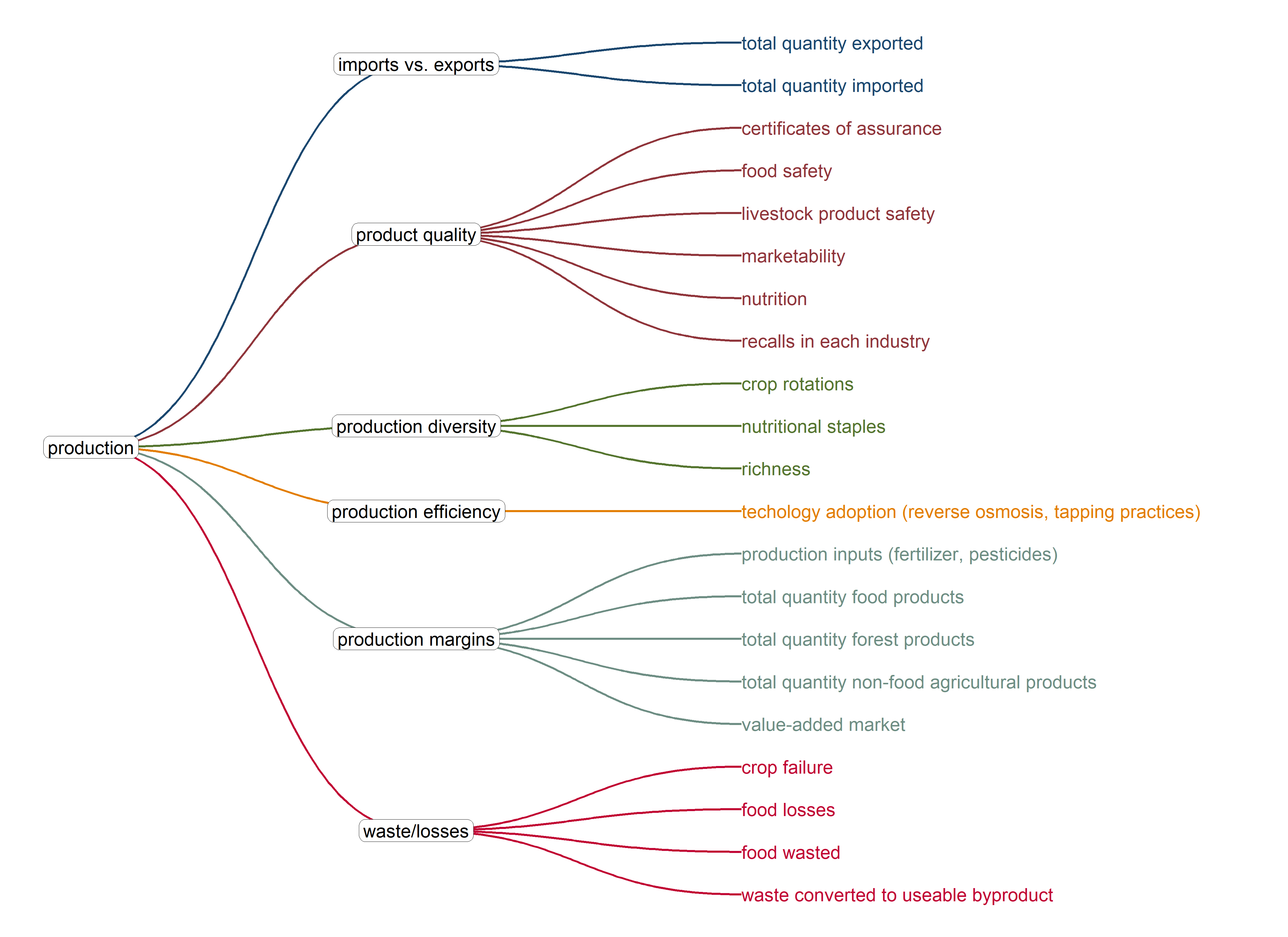
Here is the current set of indicators in the matrix, following the Sustainability Metrics workshop in July, 2024
# Use custom function in SMDO repo
source('dev/get_dimension_ggraph.R')
get_dimension_ggraph(
  csv_path = 'data/trees/matrix_tree.csv',
  dimension_in = 'Production',
  y_limits = c(-1.5, 2.1),
  palette = "ggthemes::stata_s2color"
)
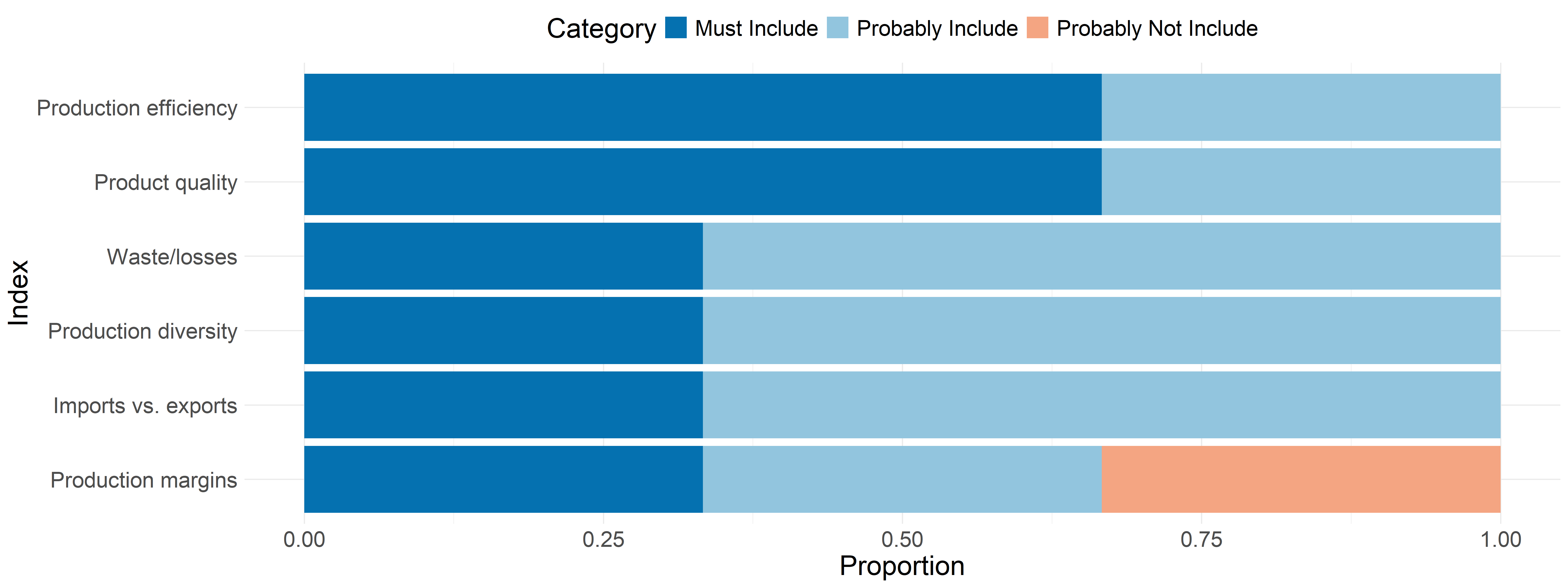
These are the results from the follow-up survey to the production indicator refinement meeting on January 15th. This feedback will be used to refine the framework for the next RFP.
raw <- read_csv('data/surveys/prod_survey.csv')

dat <- raw %>%
  select(
    ends_with('GROUP'),
  ) %>%
  setNames(c(
    'indi_must',
    'indi_probably',
    'indi_probably_not',
    'indi_must_not',
    'idx_must',
    'idx_probably',
    'idx_probably_not',
    'idx_must_not'
  )) %>%
  .[-c(1:2), ]

to_df <- function(x) {
  if (all(is.na(x))) {
    return(NULL)
  } else {
   x %>%
    str_remove(' \\(joint indicator with Marketability\\)') %>%
    str_remove('\\*.*') %>%
    str_remove(' \\(see notes with questions') %>%
    str_split(',(?!\\s)') %>% # Split on comma not followed by a space
    unlist() %>%
    table() %>%
    as.data.frame() %>%
    setNames(c('indicator', 'freq')) %>%
     arrange(desc(freq))
  }
}

indi_out <- map(dat[1:4], to_df)
idx_out <- map(dat[5:8], to_df)

# Add scores by multipliers
multipliers <- c(3:0)
ind_tables <- map2(indi_out, multipliers, ~ {
  .x %>%
    mutate(
      freq = as.numeric(freq),
      multiplier = .y,
      score = freq * multiplier,
    ) %>%
    select(indicator, freq, score)
})

# Set up DF for color graph
graph_table <- imap(ind_tables, ~ {
  col_name <- str_remove(.y, 'indi_')
  .x %>%
    rename(!!sym(col_name) := freq) %>%
    select(-score)
})

graph_table <- graph_table %>%
  reduce(full_join) %>%
  mutate(
    across(where(is.numeric), ~ ifelse(is.na(.x), 0, .x)),
    sort_key = must * 1e6 + probably * 1e4 + probably_not * 1e2 + must_not,
    indicator = fct_reorder(indicator, sort_key, .desc = TRUE)
  ) %>%
  pivot_longer(
    cols = must:must_not,
    names_to = "category",
    values_to = "count"
  ) %>%
  mutate(
    category = fct_relevel(
      category,
      "must_not",
      "probably_not",
      "probably",
      "must"
    )
  ) %>%
  group_by(indicator) %>%
  mutate(proportion = count / sum(count)) %>%
  ungroup()

# Note some missing data throws off the graph table. Fix it here
graph_table_clean <- graph_table %>%
  mutate(
    sort_key = case_when(
      str_detect(indicator, 'Production Species Diversity') ~ 3e6,
      str_detect(indicator, 'Not livestock specific') ~ 1010002,
      .default = sort_key
    )
)ggplot(graph_table_clean, aes(
y = reorder(indicator, sort_key),
x = proportion,
fill = category
)) +
geom_col(position = "stack") +
labs(
y = "Indicator",
x = "Proportion",
fill = "Category"
) +
theme_minimal() +
theme(
text = element_text(size = 20),
legend.position = 'top'
) +
scale_fill_brewer(
palette = "RdBu",
direction = -1,
limits = c(
"must",
"probably",
"probably_not",
"must_not"
),
labels = c(
"Must Include",
"Probably Include",
"Probably Not Include",
"Must Not Include"
)
)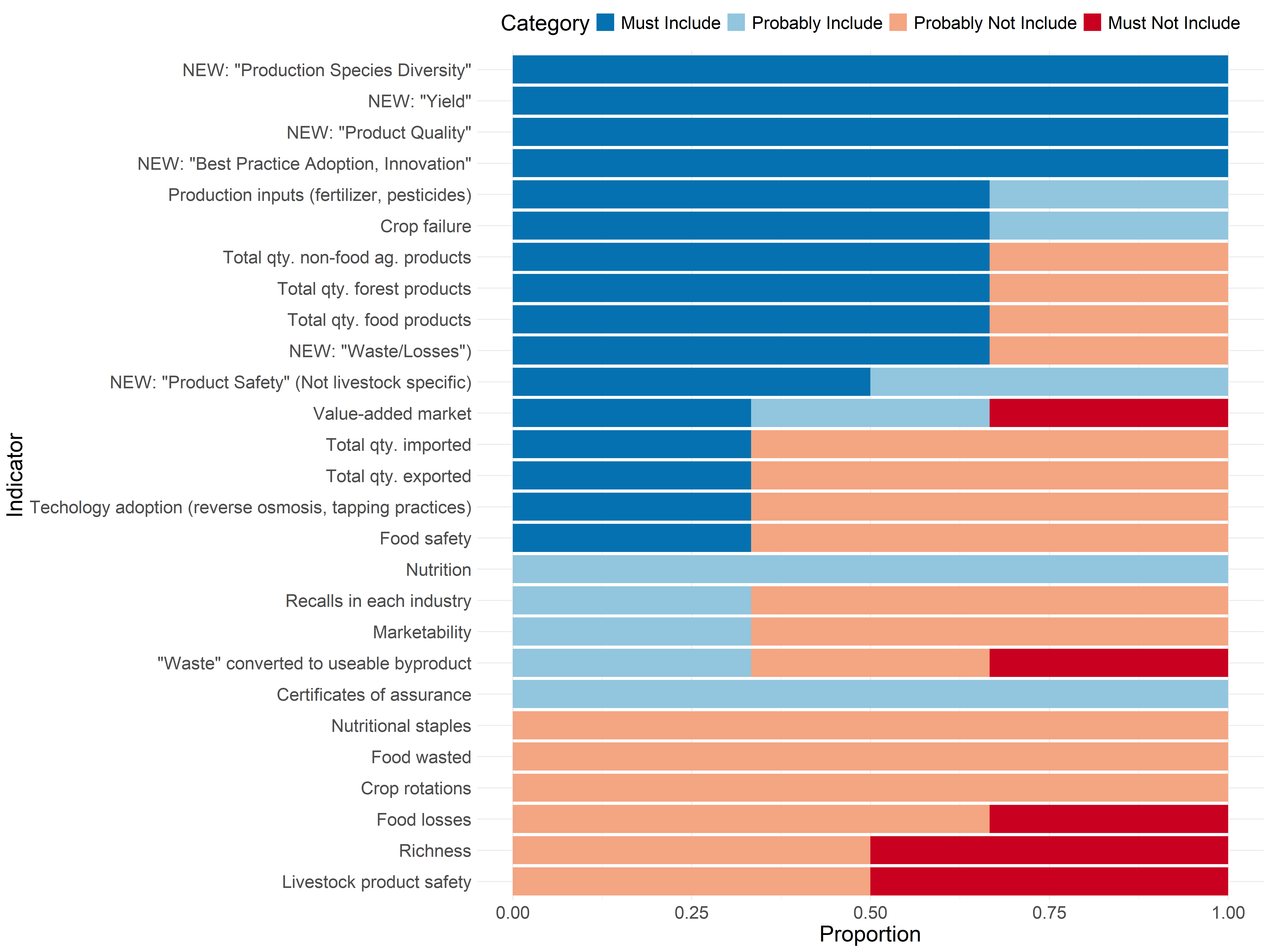
We are coding this so “Must Include” is worth 3 points, “Probably Include” is worth 2 points, “Probably Not Include” is worth 1 point, and “Must Not Include” is worth 0 points. Note that the last column is the sum of proportions of “Must Include” and “Probably Include”. You can sort, search, expand, or page through the table below.
# Add scores by multipliers
multipliers <- c(3:1)
idx_tables <- map2(idx_out[1:3], multipliers, ~ {
  .x %>%
    mutate(
      freq = as.numeric(freq),
      multiplier = .y,
      score = freq * multiplier,
    ) %>%
    select(index = indicator, freq, score)
})

# Set up DF for color graph
graph_table <- imap(idx_tables, ~ {
  col_name <- str_remove(.y, 'idx_')
  .x %>%
    rename(!!sym(col_name) := freq) %>%
    select(-score)
}) %>%
  reduce(full_join) %>%
  mutate(
    across(where(is.numeric), ~ ifelse(is.na(.x), 0, .x)),
    sort_key = must * 1e6 + probably * 1e4 + probably_not,
    sort_key = ifelse(str_detect(index, 'Carbon'), 5e6, sort_key),
    index = fct_reorder(index, sort_key, .desc = TRUE)
  ) %>%
  pivot_longer(
    cols = must:probably_not,
    names_to = "category",
    values_to = "count"
  ) %>%
  mutate(
    category = fct_relevel(
      category,
      # "must_not",
      "probably_not",
      "probably",
      "must"
    )
  ) %>%
  group_by(index) %>%
  mutate(proportion = count / sum(count)) %>%
  ungroup()


colors <- RColorBrewer::brewer.pal(4, 'RdBu')

ggplot(graph_table, aes(
  y = reorder(index, sort_key),
  x = proportion,
  fill = category
)) +
  geom_col(position = "stack") +
  labs(
    y = "Index",
    x = "Proportion",
    fill = "Category"
  ) +
  theme_minimal() +
  theme(
    text = element_text(size = 20),
    legend.position = 'top'
    ) +
  scale_fill_manual(
    values = rev(colors),
    limits = c(
      "must",
      "probably",
      "probably_not"
    ),
    labels = c(
      "Must Include",
      "Probably Include",
      "Probably Not Include"
    )
  )