Code
# Use custom function in SMDO repo
source('dev/get_dimension_ggraph.R')
get_dimension_ggraph(
  csv_path = 'data/trees/wiltshire_tree.csv',
  dimension_in = 'Environment',
  y_limits = c(-1.5, 2.1),
  palette = "ggthemes::stata_s2color"
)
This page describes the various iterations of indicator sets for the environment dimension. First, we observe the indicators included in the dimension at three points in time. The second section then shows the results of the survey following the indicator refinement meeting.
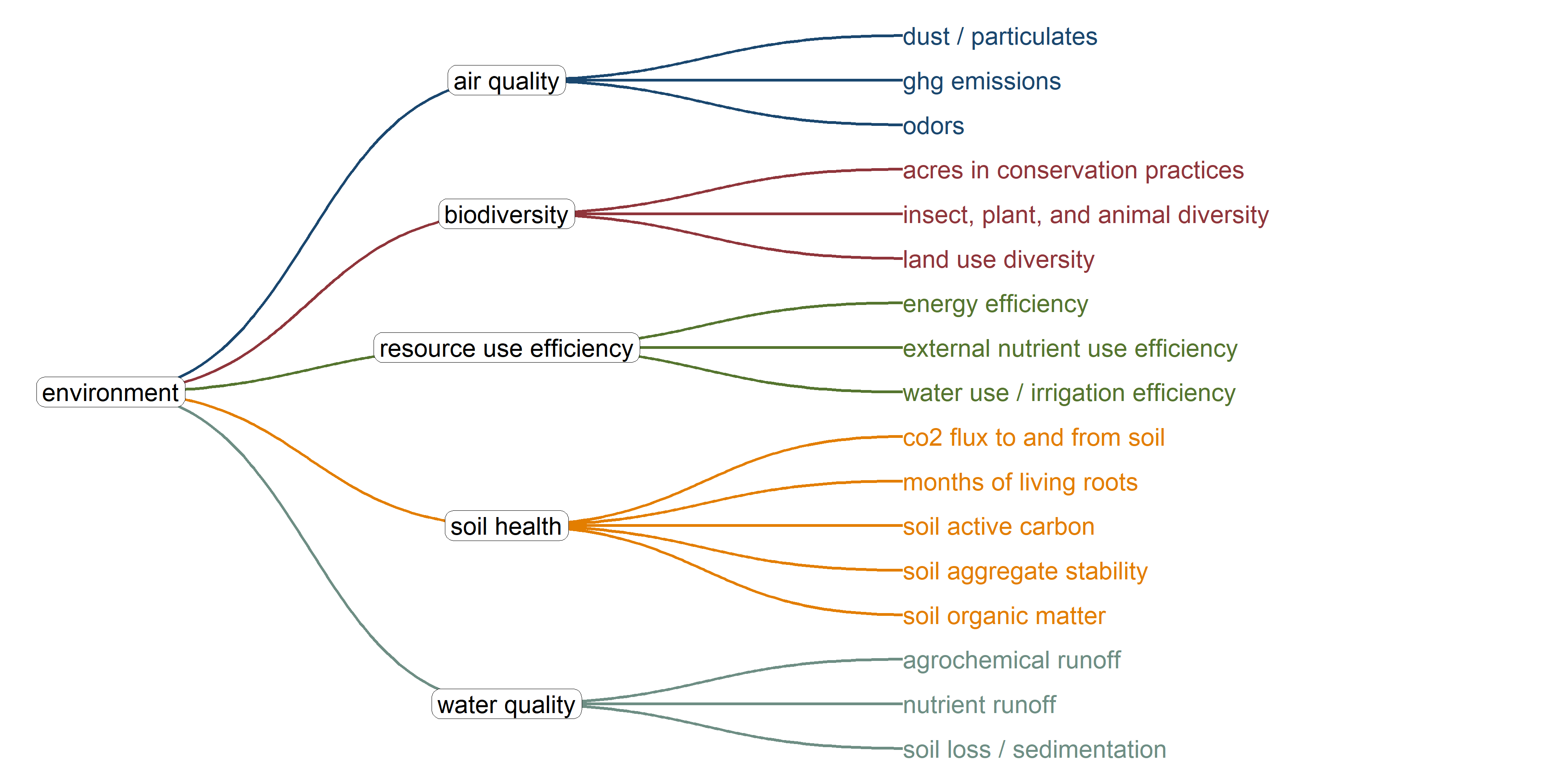
This graph shows the original framework for the dimension as described in the Wiltshire et al. paper.
# Use custom function in SMDO repo
source('dev/get_dimension_ggraph.R')
get_dimension_ggraph(
csv_path = 'data/trees/wiltshire_tree.csv',
dimension_in = 'Environment',
y_limits = c(-1.5, 2.1),
palette = "ggthemes::stata_s2color"
)
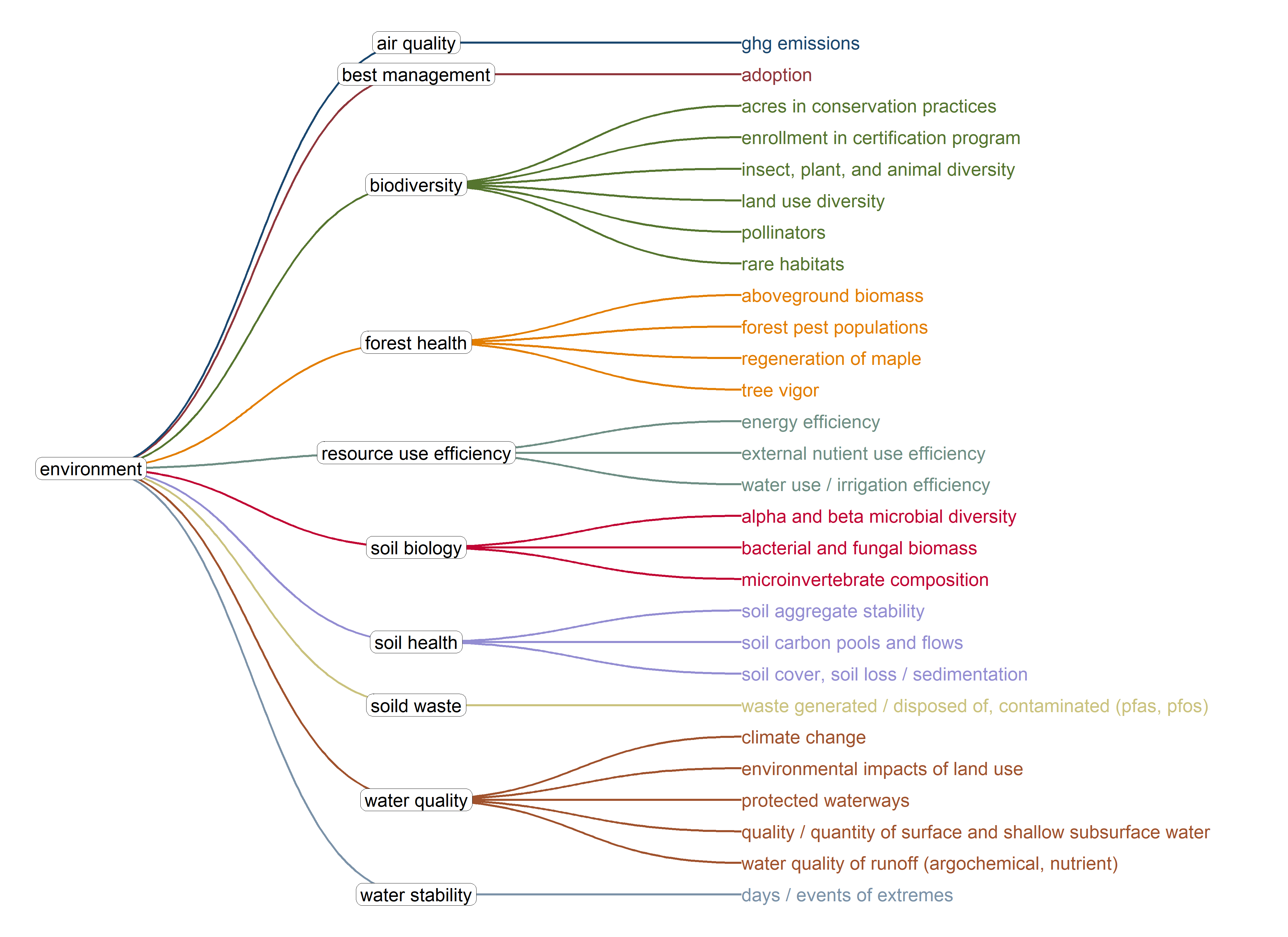
Here is the current set of indicators in the matrix, following the Sustainability Metrics workshop in July, 2024
# Use custom function in SMDO repo
source('dev/get_dimension_ggraph.R')
get_dimension_ggraph(
  csv_path = 'data/trees/matrix_tree.csv',
  dimension_in = 'Environment',
  y_limits = c(-1.5, 2.1),
  palette = "ggthemes::stata_s2color"
)
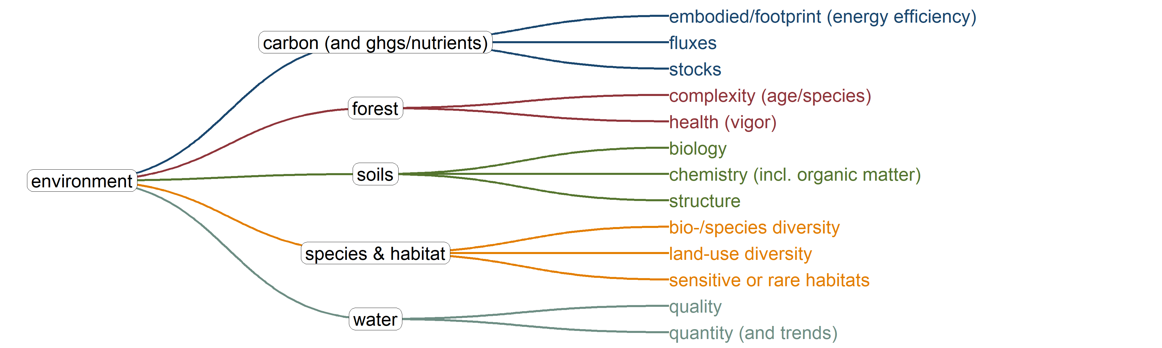
Finally, the tentative set of indicators following the indicator refinement meeting on November 22nd, 2024
# Use custom function in SMDO repo
source('dev/get_dimension_ggraph.R')
get_dimension_ggraph(
  csv_path = 'data/trees/env_meeting_tree.csv',
  dimension_in = 'Environment',
  y_limits = c(-1.5, 2.1),
  palette = "ggthemes::stata_s2color"
)
These are the results from the follow-up survey to the economic indicator refinement meeting on November 15th. This feedback will be used to refine the framework for the next RFP.
raw <- read_csv('data/surveys/env_survey.csv')

dat <- raw %>%
  select(
    ends_with('GROUP'),
  ) %>%
  setNames(c(
    'indi_must',
    'indi_probably',
    'indi_probably_not',
    'indi_must_not',
    'idx_must',
    'idx_probably',
    'idx_probably_not',
    'idx_must_not'
  )) %>%
  .[-c(1:2), ]

to_df <- function(x) {
  x %>%
    str_replace_all('PFAS, PFOS', 'PFAS/PFOS') %>%
    str_replace_all('soil loss/', 'Soil loss/') %>%
    str_split(',') %>%
    unlist() %>%
    table() %>%
    as.data.frame() %>%
    setNames(c('indicator', 'freq')) %>%
    arrange(desc(freq))
}

indi_out <- map(dat[1:4], to_df)
idx_out <- map(dat[5:8], to_df)

# Add scores by multipliers
multipliers <- c(3:0)
ind_tables <- map2(indi_out, multipliers, ~ {
  .x %>%
    mutate(
      freq = as.numeric(freq),
      multiplier = .y,
      score = freq * multiplier,
    ) %>%
    select(indicator, freq, score)
})

# Set up DF for color graph
graph_table <- imap(ind_tables, ~ {
  col_name <- str_remove(.y, 'indi_')
  .x %>%
    rename(!!sym(col_name) := freq) %>%
    select(-score)
}) %>%
  reduce(full_join) %>%
  mutate(
    across(where(is.numeric), ~ ifelse(is.na(.x), 0, .x)),
    sort_key = must * 1e6 + probably * 1e4 + probably_not * 1e2 + must_not,
    indicator = fct_reorder(indicator, sort_key, .desc = TRUE)
  ) %>%
  pivot_longer(
    cols = must:must_not,
    names_to = "category",
    values_to = "count"
  ) %>%
  mutate(
    category = fct_relevel(
      category,
      "must_not",
      "probably_not",
      "probably",
      "must"
    )
  ) %>%
  group_by(indicator) %>%
  mutate(proportion = count / sum(count)) %>%
ungroup()ggplot(graph_table, aes(
y = reorder(indicator, sort_key),
x = proportion,
fill = category
)) +
geom_col(position = "stack") +
labs(
y = "Indicator",
x = "Proportion",
fill = "Category"
) +
theme_minimal() +
theme(
text = element_text(size = 20),
legend.position = 'top'
) +
scale_fill_brewer(
palette = "RdBu",
direction = -1,
limits = c(
"must",
"probably",
"probably_not",
"must_not"
),
labels = c(
"Must Include",
"Probably Include",
"Probably Not Include",
"Must Not Include"
)
)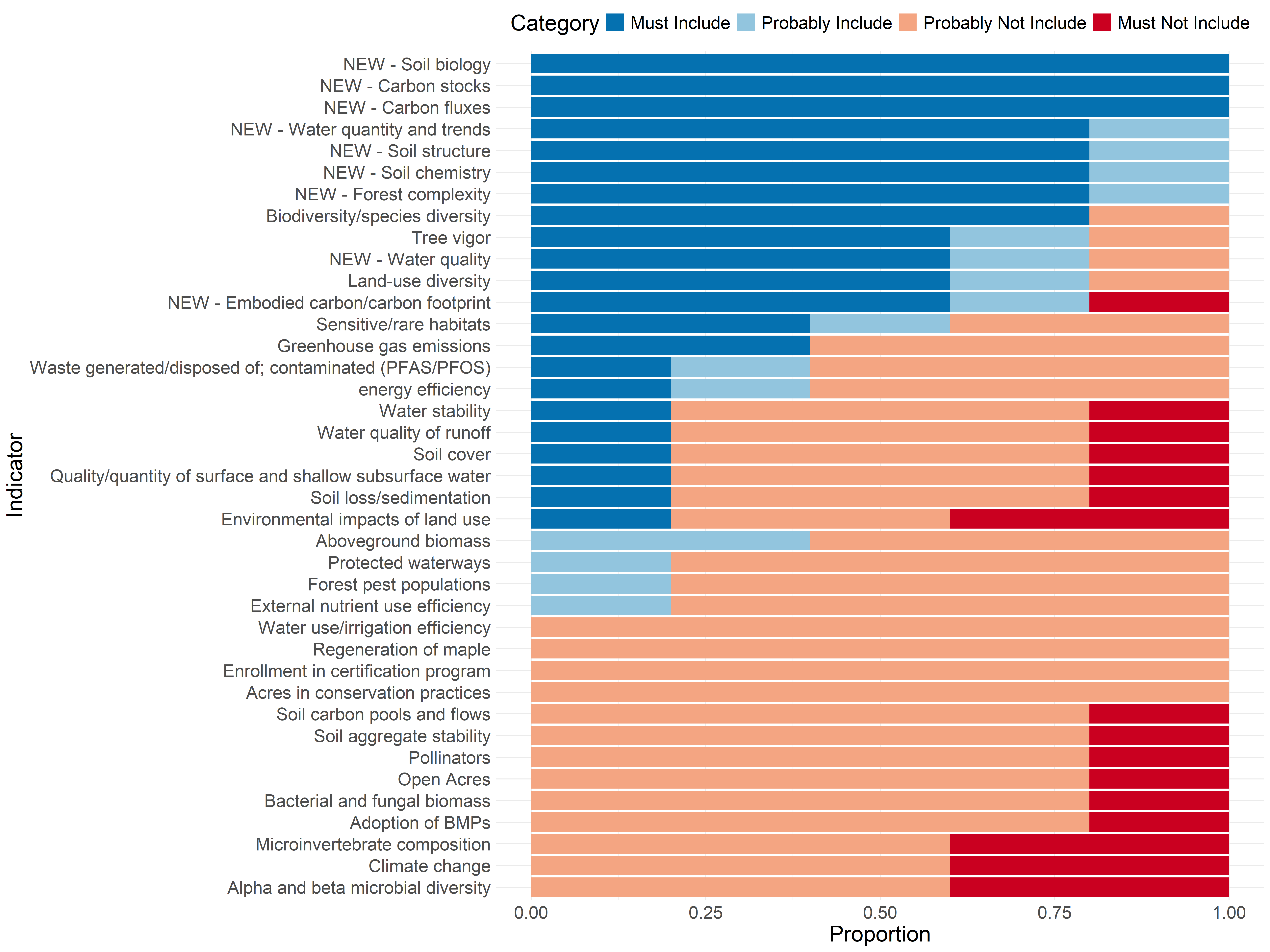
We are coding this so “Must Include” is worth 3 points, “Probably Include” is worth 2 points, “Probably Not Include” is worth 1 point, and “Must Not Include” is worth 0 points. Note that the last column is the sum of proportions of “Must Include” and “Probably Include”. You can sort, search, expand, or page through the table below.
# Add scores by multipliers
multipliers <- c(3:0)
idx_tables <- map2(idx_out, multipliers, ~ {
  .x %>%
    mutate(
      freq = as.numeric(freq),
      multiplier = .y,
      score = freq * multiplier,
    ) %>%
    select(index = indicator, freq, score)
})

# Set up DF for color graph
graph_table <- imap(idx_tables, ~ {
  col_name <- str_remove(.y, 'idx_')
  .x %>%
    rename(!!sym(col_name) := freq) %>%
    select(-score)
}) %>%
  reduce(full_join) %>%
  mutate(
    across(where(is.numeric), ~ ifelse(is.na(.x), 0, .x)),
    sort_key = must * 1e6 + probably * 1e4 + probably_not,
    sort_key = ifelse(str_detect(index, 'Carbon'), 5e6, sort_key),
    index = fct_reorder(index, sort_key, .desc = TRUE)
  ) %>%
  pivot_longer(
    cols = must:must_not,
    names_to = "category",
    values_to = "count"
  ) %>%
  mutate(
    category = fct_relevel(
      category,
      "must_not",
      "probably_not",
      "probably",
      "must"
    )
  ) %>%
  group_by(index) %>%
  mutate(proportion = count / sum(count)) %>%
  ungroup()


colors <- RColorBrewer::brewer.pal(4, 'RdBu')

ggplot(graph_table, aes(
  y = reorder(index, sort_key),
  x = proportion,
  fill = category
)) +
  geom_col(position = "stack") +
  labs(
    y = "Index",
    x = "Proportion",
    fill = "Category"
  ) +
  theme_minimal() +
  theme(
    text = element_text(size = 20),
    legend.position = 'top'
    ) +
  scale_fill_manual(
    values = rev(colors),
    limits = c(
      "must",
      "probably",
      "probably_not",
      'must_not'
    ),
    labels = c(
      "Must Include",
      "Probably Include",
      "Probably Not Include",
      "Must Not Include"
    )
  )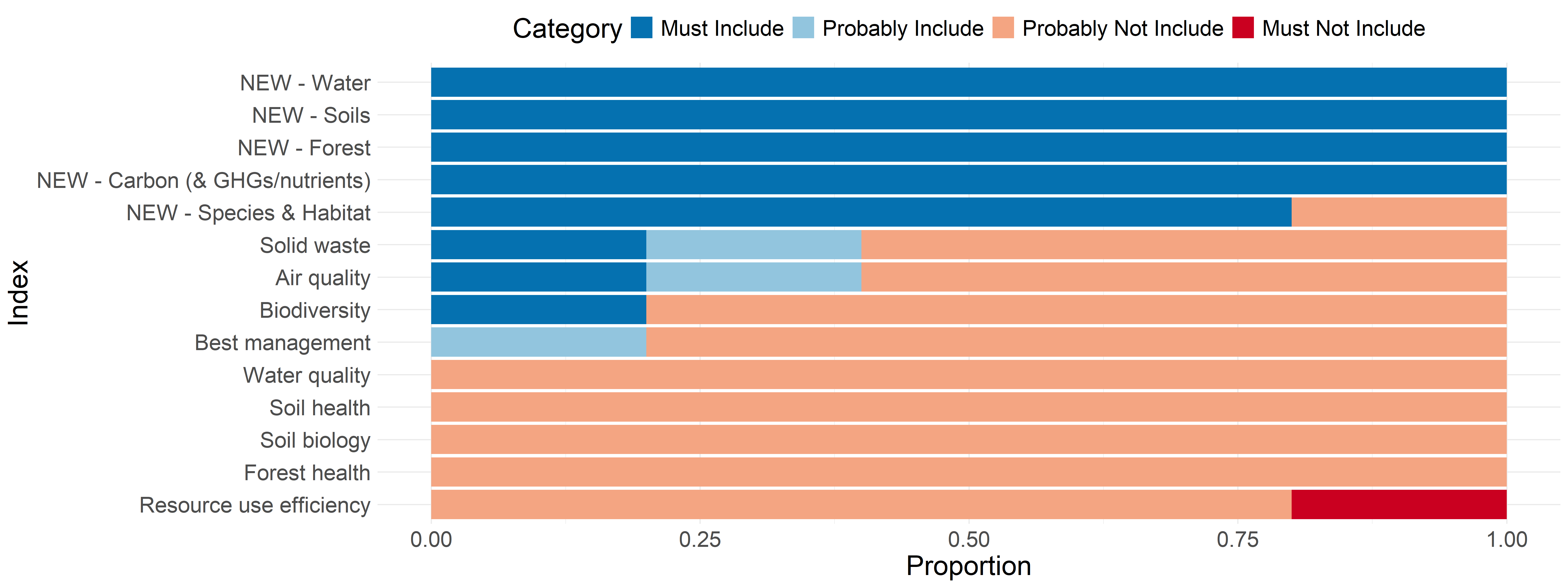
The indices are going through the same treatment as indicators above - scored from 3 to 0. Note here that the “Carbon ($ GHGs/nutrients)” index seems to be missing a vote. So, it only has 12 points, but the proportion of votes for “Must Include” is 1.