# Save to latexlatex_tab %>%kbl(format ='latex',caption ='Indicators and metrics by dimension.',label ='tab_metric_breakdown',booktabs =TRUE,escape =FALSE,digits =1 ) %>%kable_styling(font_size =10 ) %>%footnote(general_title ="",general ='\\\\textit{Note:} Representation is the percentage of indicators that are represented by at least one metric in the available data. The County Scale column shows metrics that are available at or below the county level and included in correlation and regression analyses.',threeparttable =TRUE,escape =FALSE ) %>%row_spec(6, bold =TRUE) %>%save_kable(file ='outputs/tab_metric_breakdown.tex' )# Show tabletab %>%get_reactable()
Looks like all Economics and Health indicators had a secondary metric to represent them. Environment and Production were missing a few, and Social is missing 60%.
How many metrics are at the state level vs county level? Note that we are prioritizing county and only counting state if they are not available at the county level.
We can see that the Economics, Health, and Social dimensions have rather complete data across counties, but Social and Production are missing a substantial amount.
2 Geographic
2.1 Summary Stats
Things we are interested in here:
How many metrics were represented in each county? Breakdown by dimension
Which counties have least metrics
Which metrics are only at state level
First wrangle up a Start with metrics in each county, including a population county to explore:
Code
# get_str(SMdocs::dp_metrics_county)n_county_metrics <- SMdocs::dp_metrics_county$variable_name %>% unique %>% length# Latest population of each countypops <- SMdocs::dp_weights %>%filter(variable_name =='population5YearSmooth', year =='2023') %>%select(fips, value)# Metrics per county# get_str(SMdocs::dp_metrics_county)tab_metrics <- SMdocs::dp_metrics_county %>%group_by(fips) %>%summarize(n_metrics =length(unique(variable_name))) %>%ungroup() %>%left_join(SMdata::fips_key) %>%select(-state_code) %>%left_join(pops) %>%rename(population_2023 = value) %>%mutate(population_2023 =as.numeric(population_2023)) %>%arrange(n_metrics)get_reactable(tab_metrics)
Average number of metrics in each county in across years:
Code
# Get total number of county metricstotal_metrics <- SMdocs::dp_metrics %>%filter(year >=2000, year <2025) %>% SMdata::filter_fips('counties') %>%pull(variable_name) %>%unique() %>%length()# Metric counts by county and yeartab <- SMdocs::dp_metrics %>%filter(year >=2000, year <2025) %>% SMdata::filter_fips('counties') %>%group_by(fips, year) %>%summarize(n_metrics =length(unique(variable_name)),prop_metrics = n_metrics/total_metrics ) %>%ungroup() %>%left_join(fips_key) %>%select(-state_code) %>%arrange(desc(year)) %>%mutate(prop_metrics =format(round(prop_metrics, 3), nsmall =3)) %>%filter(state_name !='Connecticut')get_reactable(tab)
Overall figures for metrics across years:
Code
# Average coverage of county overallmean_metrics_overall <-round(mean(tab$n_metrics, na.rm =TRUE), 3)prop_metrics_overall <- mean_metrics_overall/total_metrics
Average coverage of counties by state in any given year:
Note on missing data: shouldn’t be calculating it this way. 5-year data does not show up every year, even if it is complete. Need to rethink this. Expand grid to get total number of data points each county should have?
2.2 Maps
Here we explore some maps to show missingness by geography. However, they end up not being terribly helpful due to the rather subtle patterns of missingness in our data.
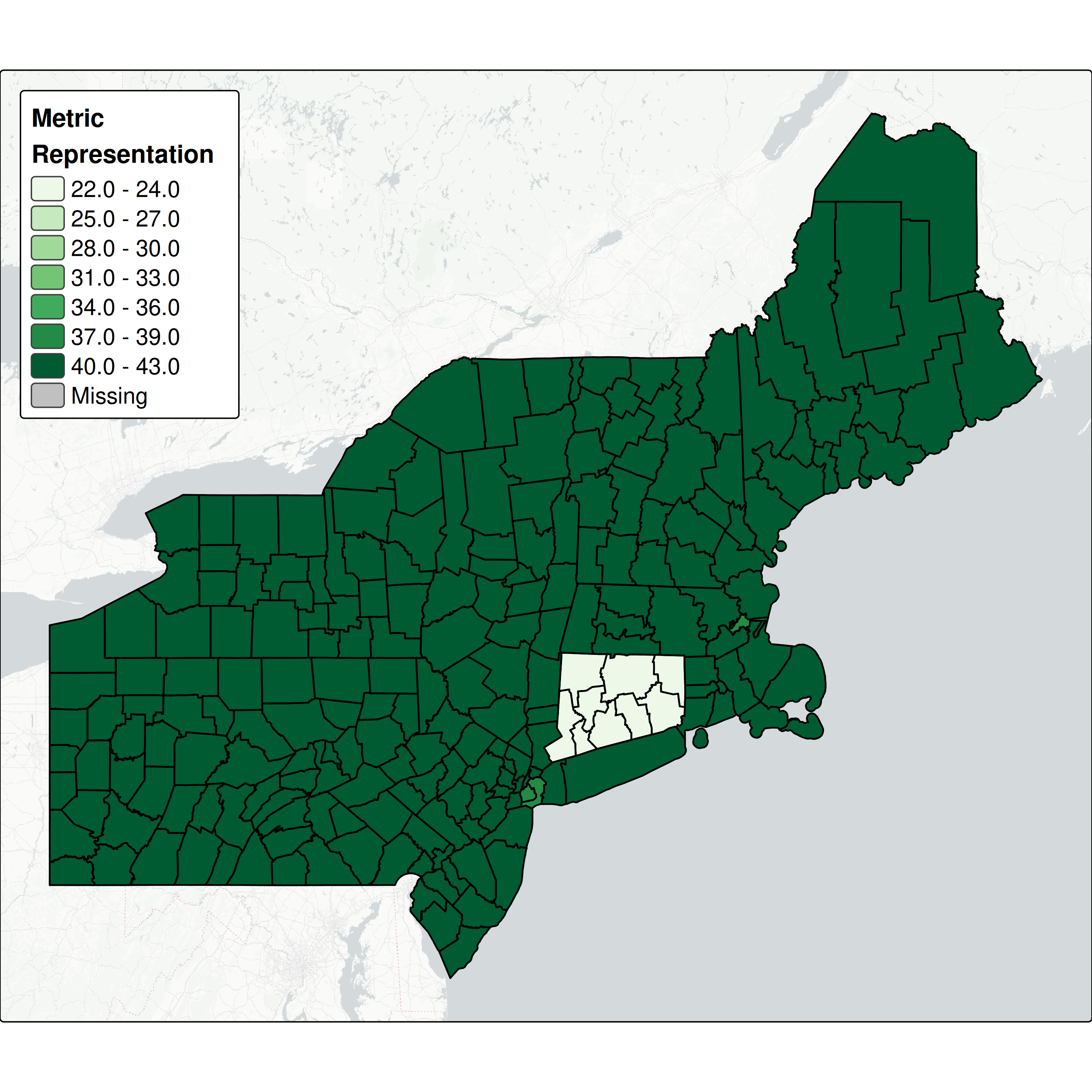
The first map shows the total number of metrics with data in each county across all five dimensions:
Code
## Get bounding box - commenting out to avoid downloading this each time# would be better off caching though# bbox_new <- st_bbox(neast_counties_2024)# xrange <- bbox_new$xmax - bbox_new$xmin # range of x values# yrange <- bbox_new$ymax - bbox_new$ymin # range of y values# # bbox_new[1] <- bbox_new[1] - (0.05 * xrange) # xmin - left# bbox_new[3] <- bbox_new[3] + (0.05 * xrange) # xmax - right# bbox_new[2] <- bbox_new[2] - (0.05 * yrange) # ymin - bottom# bbox_new[4] <- bbox_new[4] + (0.05 * yrange) # ymax - top# # tiles <- get_tiles(# bbox_new,# provider = "CartoDB.PositronNoLabels",# zoom = 7,# crop = TRUE# )# terra::saveRDS(tiles, 'data/data_paper/neast_tiles.rds')# Load tiles for backgroundtiles <- terra::readRDS('data/data_paper/neast_tiles.rds')# Counts of unique metrics in each county# var_counts <- datasets$dp_metrics_all %>% var_counts <- dp_metrics_county %>%group_by(fips) %>%summarize(n_metrics =length(unique(variable_name)))# Join df <- neast_counties_2024 %>%left_join(var_counts)tmap_mode('plot')map <-tm_shape(tiles) +tm_rgb() +tm_shape(df) +tm_polygons("n_metrics", palette ="brewer.greens",title ="Metric\nRepresentation",breaks =c(seq(22, 43, 3)),breaks =seq(min(var_counts$n_metrics), max(var_counts$n_metrics), 5),fill.legend =tm_legend(reverse =TRUE ) ) +tm_borders(col ='black', lwd =1.25) +tm_layout(legend.position =c('left', 'top'),legend.title.fontface ='bold',legend.width =8,legend.height =12,legend.title.size =1.1,inner.margins =rep(0, 4),outer.margins =rep(0, 4),legend.text.size =1 )# tmap_save(# tm = map,# filename = 'outputs/metric_coverage_map.png',# asp = 0,# dpi = 300# )
Connecticut falls out of this due to the county/region transition. For the rest of our counties, we don’t really have the granularity to tell how different they are across dimensions. What we can see is that some of our most urban counties around New York and Boston are missing a handful of metrics.
Let’s try an interactive map so we can explore each dimension individually. Use the layer symbol in the top left to select which dimension to view. These maps show the proportion of the total metrics available in each county.
Code
# How many total metrics at county leveltotal_count <- dp_metrics_county %>%pull(variable_name) %>% unique %>% lengthtotal_count# Dimension crosswalkcrosswalk <- dp_meta %>%select(dimension, variable_name)dimension_counts <- dp_meta %>%select(dimension, variable_name, resolution) %>%filter(!is.na(variable_name), resolution !='state') %>%select(-resolution) %>%group_by(dimension) %>%summarize(count =n())dimension_counts# Counts of unique metrics in each county by dimensionvar_counts <- dp_metrics_county %>%left_join(crosswalk) %>%group_by(dimension, fips) %>%summarize(n_metrics =length(unique(variable_name)) ) %>%left_join(dimension_counts) %>%mutate(prop_metrics = n_metrics / count)var_counts# Join df <- neast_counties_2024 %>%left_join(var_counts)get_str(df)maps <- df %>%split(.$dimension) %>%imap(~ { to_hide <-ifelse(.y =='economics', FALSE, TRUE)mapview( .x, layer.name = .y, zcol ="prop_metrics",hide = to_hide,# col.regions = brewer.pal(5, "Greens"),col.regions =rev(viridis(5)),alpha.regions =0.7 ) })
3 Temporal
This section explores the growth in metric and indicator counts over time.
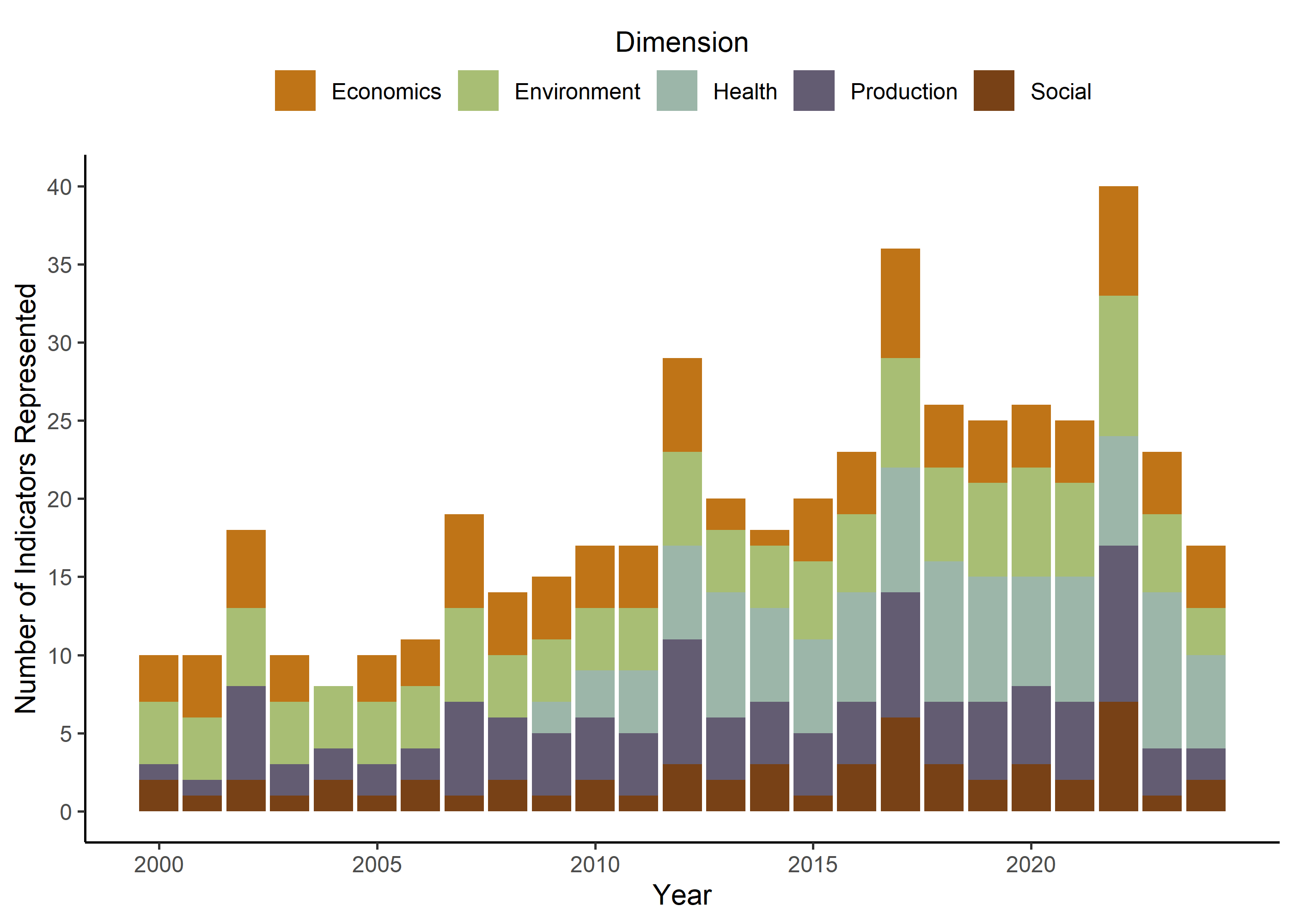
3.1 Indicators
Here we show the total number of indicators represented each year, colored by dimension. We can see the growth in represented indicators over time, as well as the 5-year update cycle of NASS and the American Community Survey. Credits to Isabella Loconte on this graph!
Code
# Join based on 'variable_name'merged_df <- SMdocs::dp_metrics %>%left_join(SMdocs::dp_meta %>%select(variable_name,dimension = dimension,index = index,indicator = indicator ),by ="variable_name") # Filter out before 2000 and NAs; create "indicator count"indicators_by_year_data <- merged_df %>%filter(!is.na(indicator)) %>%filter(year >=2000, year <2025) %>%distinct(indicator, dimension, year) %>%count(year, dimension, name ="indicator_count") %>%mutate(year =as.numeric(year))get_str(indicators_by_year_data)
# Histogramindicator_plot <-ggplot( indicators_by_year_data, aes(x = year, y = indicator_count, fill = dimension) ) +geom_col(position ="stack") +scale_y_continuous(breaks =seq(0, max(1000), by =5)) +# max is set to 1000 values - change max for more datascale_x_continuous(breaks =seq(min(indicators_by_year_data$year), max(indicators_by_year_data$year),by =5)) +scale_fill_manual(values = dp_fill_palette,labels = to_title_case ) +labs(x ="Year",y ="Number of Indicators Represented",fill ="Dimension" ) + SMdocs::dp_theme# Save to outputsggsave( indicator_plot,filename ='outputs/fig_indicator_coverage.png',width =5,height =4,units ='in',dpi =300,bg ='white')# Render to Quartoindicator_plot
Same data but in a table for easy reporting:
Code
# Get totals by year:totals <- indicators_by_year_data %>%group_by(year) %>%summarize(total_indicators =sum(indicator_count)) %>%ungroup()get_reactable(totals)
Here we have metric representation by year - another graph made by Isabella. This one is focused on the metrics themselves, and provides a better look at update schedules and data availability over time.
Code
# Join based on "variable_name"metrics_and_meta <- SMdocs::dp_metrics %>%left_join(SMdocs::dp_meta %>%select(variable_name, dimension, index, indicator, metric),by ="variable_name") # get_str(metrics_and_meta)# Group dimension columns together in ascending order; filter out before 2000 # and NAsheatmap_easy_data <- metrics_and_meta %>%filter(!is.na(indicator)) %>%filter(year >=2000, year <2025) %>%distinct(indicator, dimension, year, metric)heatmap_easy_data <- heatmap_easy_data %>%mutate(dimension =factor(dimension, levels =sort(unique(dimension))) ) %>%filter(!is.na(metric)) %>%arrange(dimension, metric) %>%mutate(metric =factor(metric, levels =rev(unique(metric))) )heatmap_easy_data <- heatmap_easy_data %>%distinct(year, dimension, metric)# Full grid of all combinations (to show blanks)full_grid <-expand.grid(metric =levels(heatmap_easy_data$metric),year =unique(heatmap_easy_data$year),stringsAsFactors =FALSE)# Left join to get "present" boxesdata_full <-left_join(full_grid, heatmap_easy_data, by =c("metric", "year"))# Make sure metric ordering is rightdata_full <- data_full %>%mutate(metric =factor( metric,levels =levels(heatmap_easy_data$metric) ) )metric_heatmap <-ggplot( data_full, aes(x =as.factor(year), y = metric, fill = dimension)) +geom_tile(color ="gray80", linewidth =0.25) +scale_y_discrete() +scale_x_discrete(breaks =seq(2000, 2024, 6) ## breaks = seq(2000, 2024, 4) ) +scale_fill_manual(values =c(dp_fill_palette, "FALSE"="white"),na.value ="white",labels = to_title_case,na.translate =FALSE ) +labs(x ="Year",y ="Metric",fill ="Dimension" ) + SMdocs::dp_theme +theme( legend.position ='right'# ) +# scale_color_discrete(guide = guide_legend(keywidth = 0.4, keyheight = 0.4)) +guides(# fill = guide_legend(nrow = 2, byrow = TRUE),fill =guide_legend(direction ='vertical') ) +coord_fixed(ratio =1.5) ## Save to outputs for paperggsave( metric_heatmap,filename ='outputs/fig_metric_heatmap.png',width =6,height =8,units ='in',dpi =300,bg ='white')# Render to Quartometric_heatmap