The plan here is to explore uncertainty and sensitivity in dimensions and indicators. Given our 3 transformation methods, 3 rescaling methods, and 2 aggregation methods, we have 18 ways to build the framework. We also have 38 indicators, and if we include iterations where we omit each indicator one time, that adds another 39 options (1 where all are included). In total, this gives us 702 options in our uncertain inputs. We will map through them all and get a distribution of dimension scores for Vermont that shows how confident we are in our uncertain inputs.
1 Dimensions
1.1 Sensitivity
First we set up our input grid of 702 iterations.
Code
## Load data for aggregationsstate_key <-readRDS('data/sm_data.rds')[['state_key']]# metrics_df <- readRDS('data/metrics_df.rds')valued <-readRDS('data/valued_rescaled_metrics.rds')framework <-readRDS('data/filtered_frame.rds')# Set up options for uncertain input factorstransformations <-c('raw', 'boxcox', 'winsor')scalings <-c('rank', 'minmax', 'zscore')aggregations <-c('geometric', 'arithmetic')# Get unique values of metrics and indicators. We will leave each one out once,# plus the 'none' value means we use them all (don't remove any)metrics <-c('none', framework$variable_name)length(metrics) # 125 metrics (plus none is 126)indicators <-c('none', unique(framework$indicator))length(indicators) # 38 indicators (plus none is 39)# Create grid of combinationsgrid <-expand.grid( transformations, scalings, aggregations, indicators) %>%setNames(c('transformation', 'scaling', 'aggregation', 'indicator'))get_str(grid)
Now we run all 702 iterations and save dimension score results
Code
# We are commenting out this cell chunk so that we don't actually run it. # This is where we run 702 iterations to get distributions of scores for VT.# For each set of input factors, get dimension scores for VT# tic()# plan(multisession, workers = parallelly::availableCores(omit = 1))# # out <- future_map(1:nrow(grid), \(i) {# # # Print outputs for debugging# print(grid[i, ])# get_time(c('\n~~~~~ Starting row ', i, ' at:'))# # # Get iteration specs to pull df from valued data# iter_specs <- paste0(# as.character(grid[i, 1]),# '_',# as.character(grid[i, 2])# )# # # Run model# model_out <- get_all_aggregations(# normed_data = valued[iter_specs],# framework = framework,# state_key = state_key,# aggregation = grid$aggregation[i],# remove_indicators = grid$indicator[i]# )# return(model_out)# }, .progress = TRUE)# # plan(sequential)# toc()# # 168s in parallel for 702 iterations# # get_str(out)# get_str(out, 4)# # # Save this so we don't have to run it again# saveRDS(out, 'data/objects/sensitivity_out.RDS')
Finally, put them back together in a sensible way
Code
# Load up saved sensitivity outsens_out <-readRDS('data/objects/sensitivity_out.RDS')## Get names of sampled inputs to identify latersampled_inputs <-map_chr(1:nrow(grid), ~ {paste0(c(as.character(grid[.x, 1]), as.character(grid[.x, 2]), str_sub(grid[.x, 3], end =3), snakecase::to_snake_case(as.character(grid[.x, 4])) ), collapse ='_' )})# Pull out just VT dimension scoresdimension_df <-map_dfr(sens_out, ~ { df <- .x[[1]]$dimension_scores %>%as.data.frame() %>%filter(str_length(state) ==2) %>%mutate(across(!state, ~as.numeric(dense_rank(.x)), .names ="{.col}_rank" )) %>%filter(state =='VT') %>%select(matches(regex('_')))}) %>%mutate(inputs = sampled_inputs)get_str(dimension_df, 3)# Each line is result from one sample.# Get vector of dimension rank namesdimension_ranks <-str_subset(names(dimension_df), '_') %>%str_remove('_rank') %>% snakecase::to_title_case()
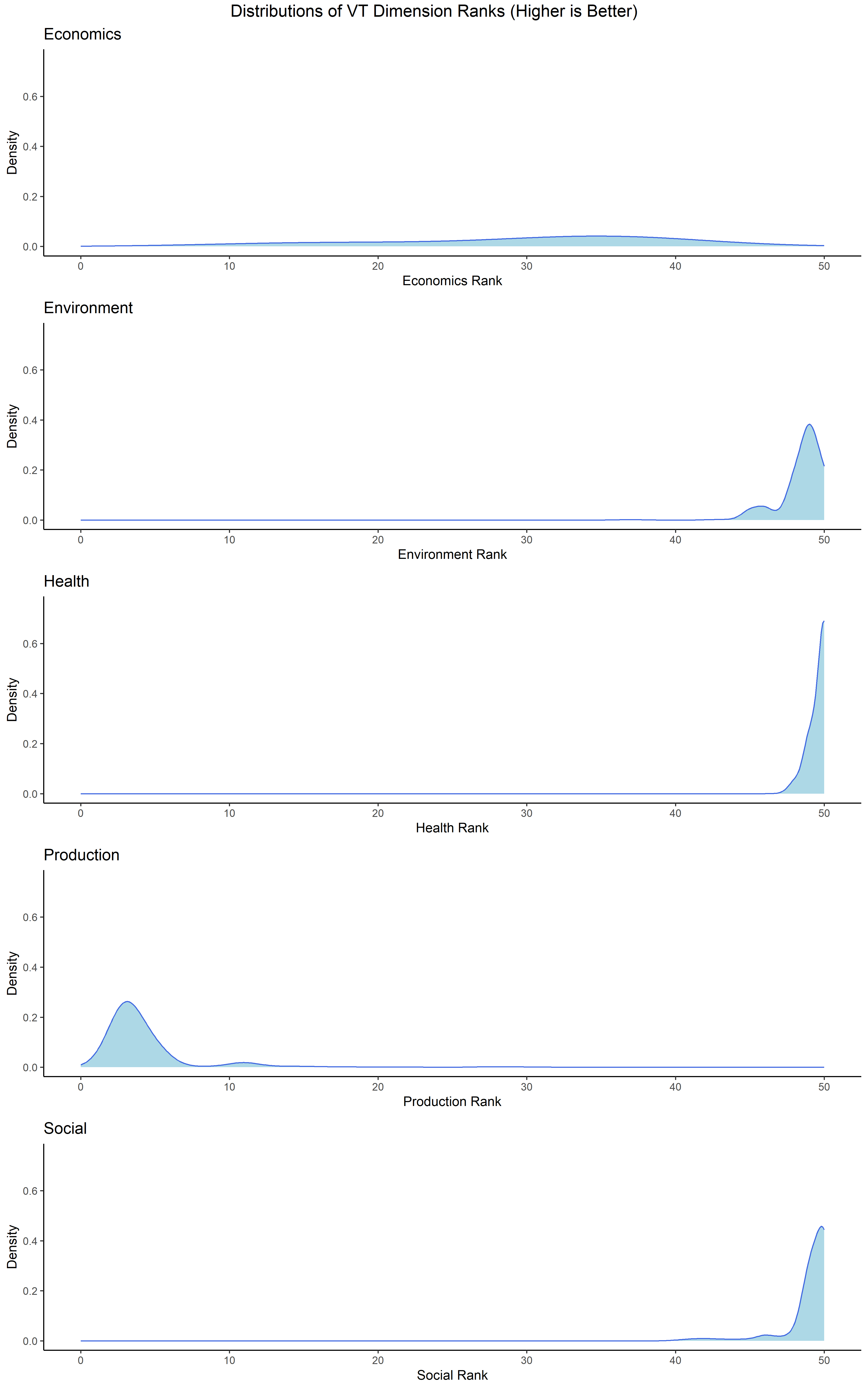
And now plot our results.
Code
plots <-map2(str_subset(names(dimension_df), '_'), dimension_ranks, ~ { dimension_df %>%ggplot(aes(x =!!sym(.x))) +geom_density(fill ='lightblue',color ='royalblue',adjust =3 ) +theme_classic() +labs(x =paste(.y, 'Rank'),y ='Density',title = .y ) +xlim(0, 50) +ylim(0, 0.75)}) %>%setNames(c(stringr::str_to_lower(dimension_ranks)))# Save these plots for presentationsaveRDS(plots, 'preso/plots/dimension_sensitivity_plots.rds')# Arrange into a single diagramplot <-ggarrange(plotlist = plots,nrow =5,ncol =1)annotate_figure( plot,top =text_grob('Distributions of VT Dimension Ranks (Higher is Better)',size =14,hjust =0.5 ))
1.2 Cronbach
Take valued scaled (but not aggregated) data and see what Cronbach looks like at the dimension level. Note that Cronbach’s Alpha is a fraught metric at best, and this is certainly an unconventional use of it here. It might still be an interesting tool to measure internal reliability as we explore how cohesive and sensible our dimensions are.
Code
valued <-readRDS('data/valued_rescaled_metrics.rds')framework <-readRDS('data/filtered_frame.rds')# Do this with filtered framework of 125 metrics, using minmaxminmax_dat <- valued$raw_minmax %>%select(all_of(unique(framework$variable_name)))get_str(minmax_dat)# For each dimension, get cronbach for all metrics within itdimensions <-unique(framework$dimension)cronbachs <-map(dimensions, ~ { dim_metrics <- framework %>% dplyr::filter(dimension == .x) %>%pull(variable_name) %>%unique() cronbach <- minmax_dat %>%select(all_of(dim_metrics)) %>% psych::alpha(check.keys =FALSE)return(cronbach)}) %>%setNames(c(dimensions))cronbachs(cronbach_alphas <-map(cronbachs, ~ .x$total$raw_alpha))# Save this for presentation# First make it a nice tableout <- cronbach_alphas %>%as.data.frame() %>%t() %>%as.data.frame() %>% tibble::rownames_to_column() %>%setNames(c('Dimension', 'Alpha')) %>%mutate(Alpha =round(Alpha, 3))outsaveRDS(out, 'preso/data/cronbach_dimensions.rds')
2 Indicator Sensitivity
For indicator sensitivity, we are using the same iterations we used in the dimension analysis. However, here we just take the 18 iterations without a given indicator and compare them to the 18 iterations with that indicator to see how much the dimension score for Vermont changes.
Code
# Get a cleaner df to work with our indicatorsget_str(dimension_df)ind_df <- dimension_df %>%mutate(indicator =str_split_fixed(inputs, '_', 4)[, 4]) %>%select(-inputs)get_str(ind_df)# Get a version of framework with indicators in snake case to matchsnake_framework <- framework %>%mutate(indicator = snakecase::to_snake_case(indicator))unique_indicators <- ind_df$indicator %>%unique() %>%str_subset('none', negate =TRUE)# Map over indicators to get the 'without' scores, then get differenceinfluence_df <-map(unique_indicators, \(ind) {# Get scores with all indicators in that dimension. This is the 'none' option with <- ind_df %>% dplyr::filter(indicator =='none') %>%summarize(across(where(is.numeric), ~mean(.x)))# Get scores with that dimension's indicators but WITHOUT that indicator# Note that we set it equal to that indicator to get get data without it... without <- ind_df %>% dplyr::filter(indicator == ind) %>%summarize(across(where(is.numeric), ~mean(.x)))# Get difference in dimension scores, with and without# Will show impact of including it out <- with - withoutreturn(out)}) %>%bind_rows() %>%mutate(indicator = unique_indicators)get_str(influence_df)# Now we need to pull this apart into 5 data frames, one for each dimensiondim_dfs <-list()for (i in1:5) { name <-names(influence_df)[i] dim_dfs[[name]] <- influence_df %>%filter(.data[[name]] !=0) %>%mutate(rank_diff = .data[[name]]) %>%select(indicator, rank_diff) %>%mutate(Influence =ifelse(rank_diff >0, 'Positive', 'Negative'),indicator = snakecase::to_title_case(indicator) )}get_str(dim_dfs)# Noice# Get range of min and max across all plots to set axesrange <-map(dim_dfs, ~ .x$rank_diff) %>%unlist() %>%range()# Make all plots, one for each dimensionind_plots <-imap(dim_dfs, ~ { title_name <- .y %>%str_remove('_rank') %>% snakecase::to_title_case() .x %>%mutate(rank_diff =round(rank_diff, 3)) %>%ggplot(aes(x =fct_reorder(indicator, rank_diff), y = rank_diff, color = Influence,text =paste0('<b>Indicator:</b> ', indicator, '\n','<b>Influence on Rank:</b> ', rank_diff ) )) +geom_segment(aes(x =fct_reorder(indicator, rank_diff),xend = indicator,y =0,yend = rank_diff ),color ='grey' ) +geom_point(size =2.5) +geom_text(aes(label = indicator, color = Influence ),nudge_x =0.25,show.legend =FALSE ) +geom_hline(yintercept =0, lty =2,alpha =0.4 ) +coord_flip() +theme_classic() +labs(x =NULL,y ='Average Difference in Vermont Rank When Included',title =paste0('Influence of Indicators on ', title_name) ) +theme(axis.text.y =element_blank(),axis.title.y =element_blank(),axis.ticks.y =element_blank(),axis.line.y =element_blank(),legend.position ='none' ) +ylim(range[1] -6, range[2] +6)}) %>%setNames(c(stringr::str_to_lower(dimension_ranks)))# Save these for presosaveRDS(ind_plots, 'preso/plots/ind_influence_plots.rds')
2.1 Economics
2.2 Environment
2.3 Health
2.4 Production
2.5 Social
We can see that most dimensions are quite tight, health in particular. The economics dimension is less certain, as each indicator makes a big difference. We can also see that the production species diversity indicator is particularly impactful on Vermont’s production dimension score. This might mean Vermont is an outlier, but it might also mean this indicator or the metric that represents it is not doing it justice. Turns out this indicator is represented by a single metric, a diversity index based on the USDA Cropland Data Layer. This is tailored toward commodity crops, and gives Vermont a particularly low score. This might be a sign of a bad indicator/metric.